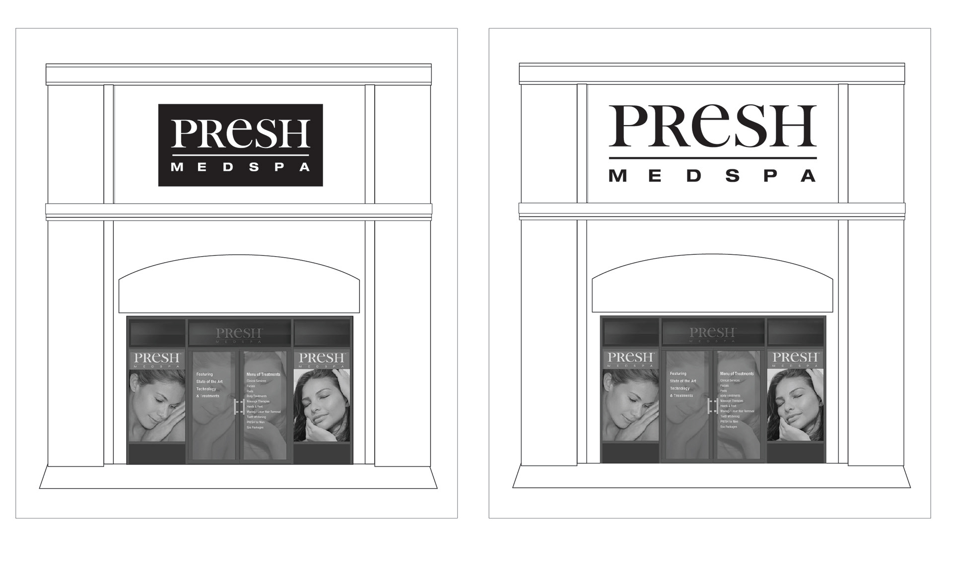
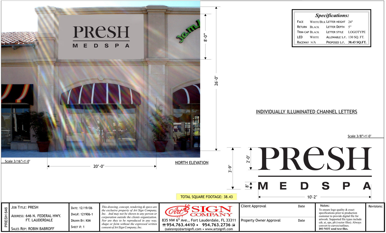
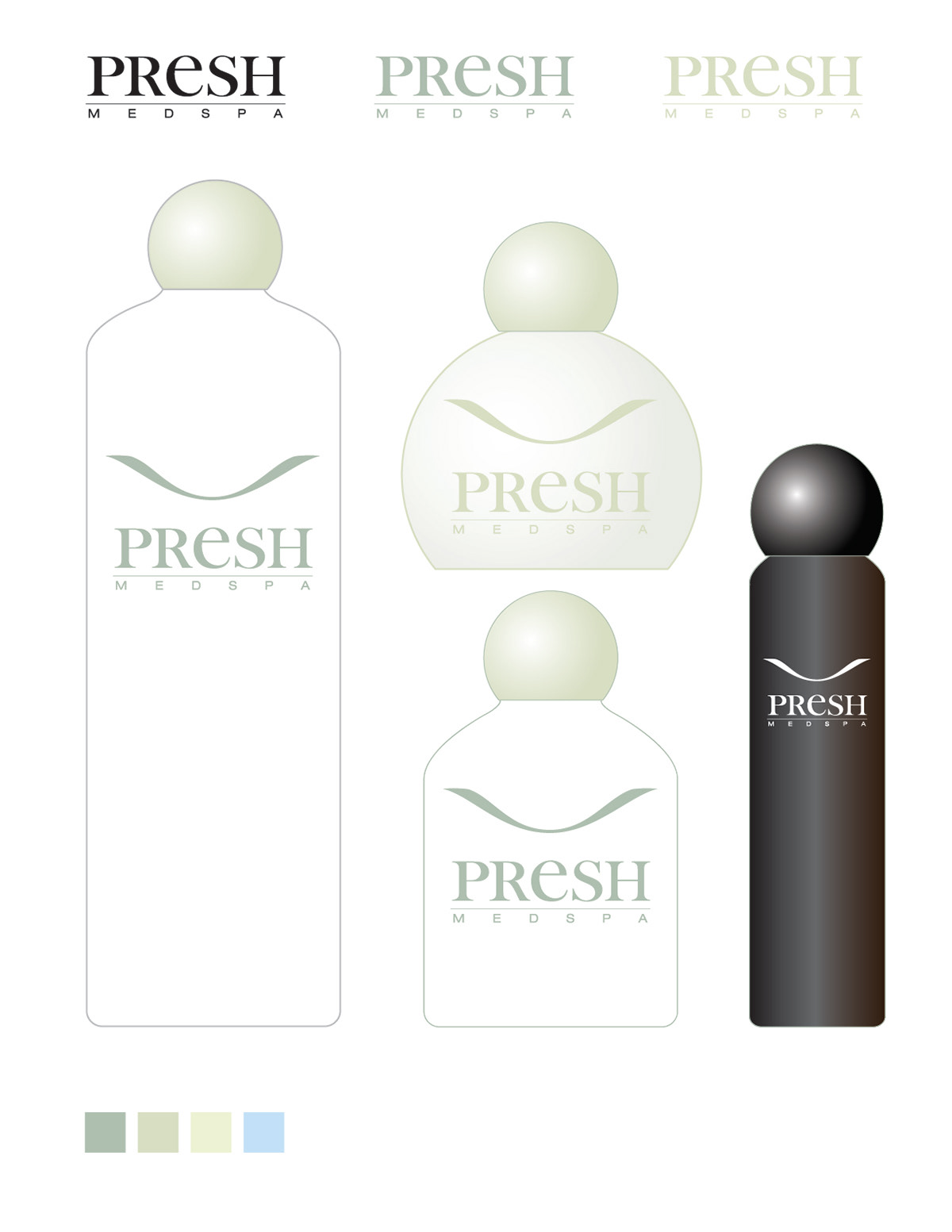
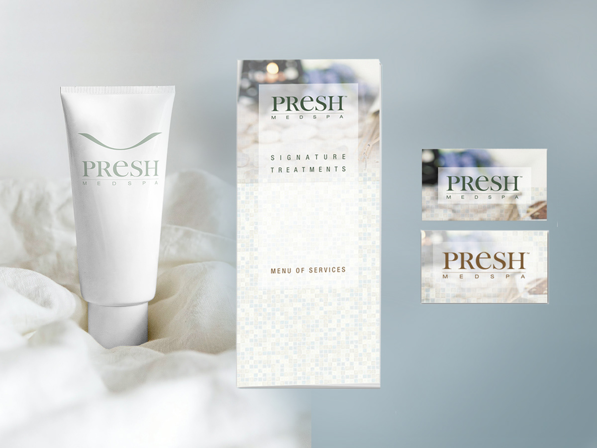
When the client approached me, they wanted to work with one source for comprehensive brand development, a website, print collateral such as menus and cards in addition to some product labeling and storefront concepts.
We began the brand development with a logo design. Here we have one of our first exercises—six potential designs mixed in with 18 established brand ID's selected from our own list and some suggestions from the client. In part, we were offering visual proof that some of their ideas about color and font would prevent them from achieving that air of elegance and refinement.
The Presh folks aspired for their brand to be a glamour/fashion/cosmetic/luxury competitor so we collected many of those iconic logotypes to illustrate a few key factors.
1. None of them had color assigned to the mark. Anywhere we looked at exterior signage or packaging, these brands were always rendered as black or white(knockout).
2. None of them used any sort of "novelty" typography or anything other than classic, clear, readable, distinct designs. They could be rendered in print or cut from metal and bolted to a facade.
3. They all had personality as a name, rarely with any type of icon—and that personality was strong and consistent.
As we developed the chosen design, we applied it to all possible scenarios. The ID is distinct and exceeds expectations.


